"Get a FREE Packaging & Brand Audit"
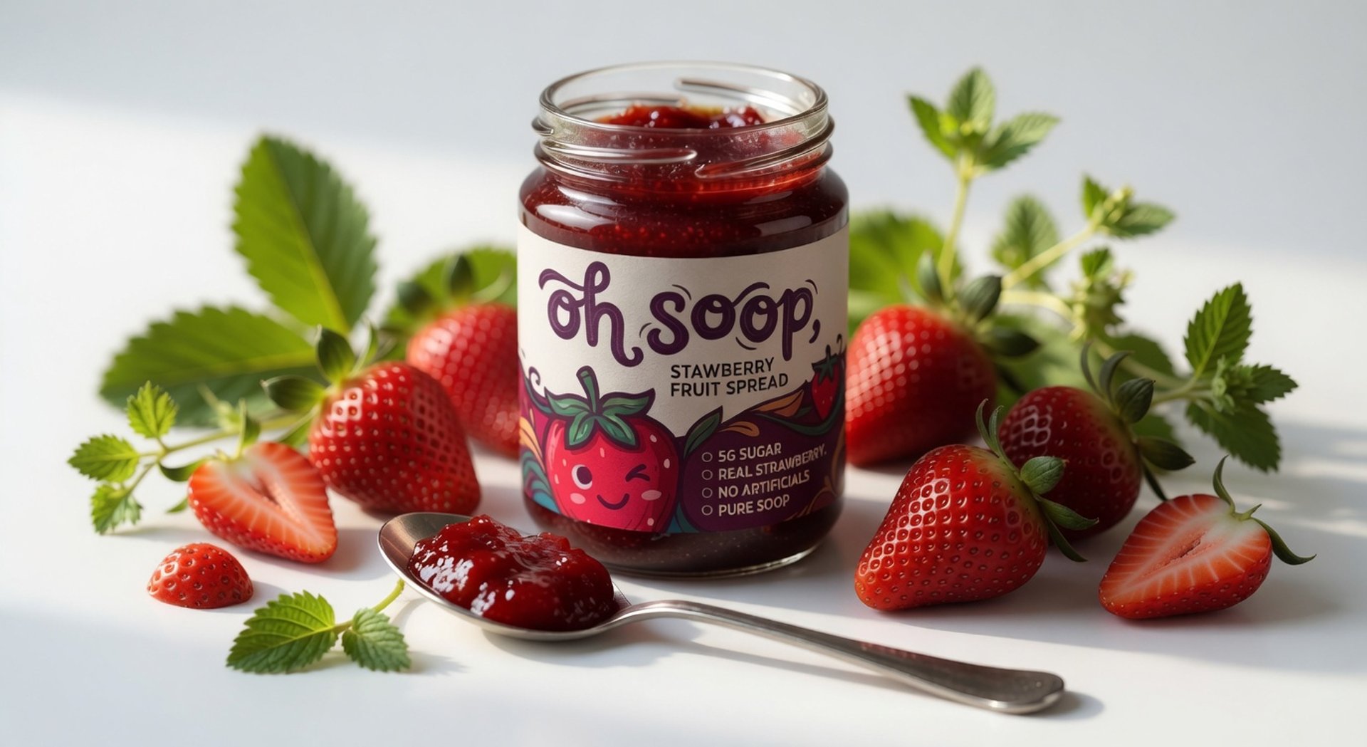
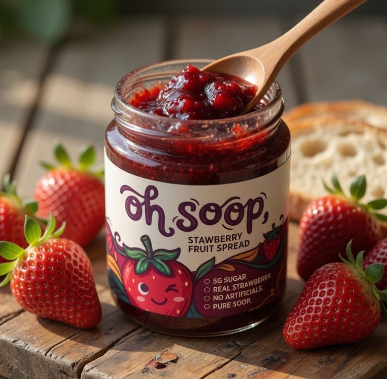
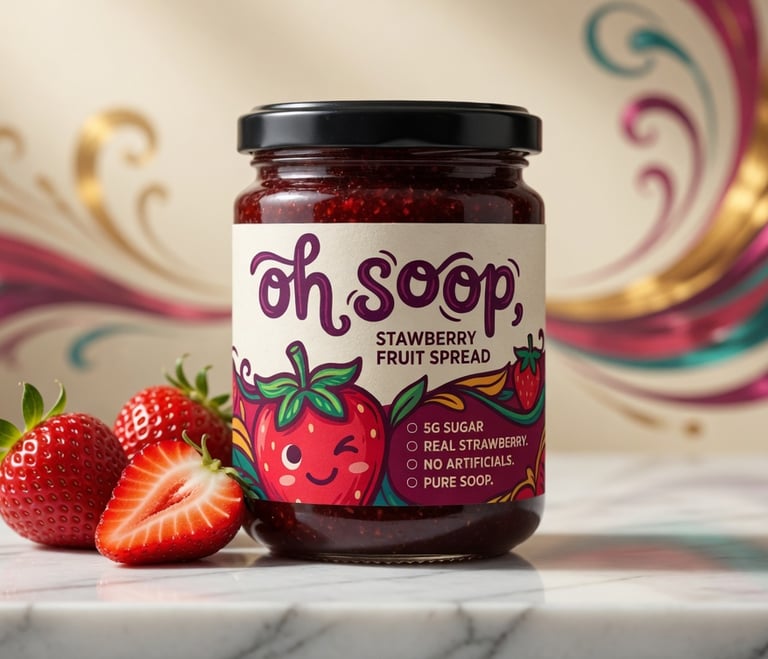
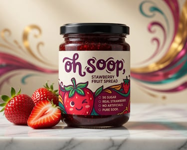
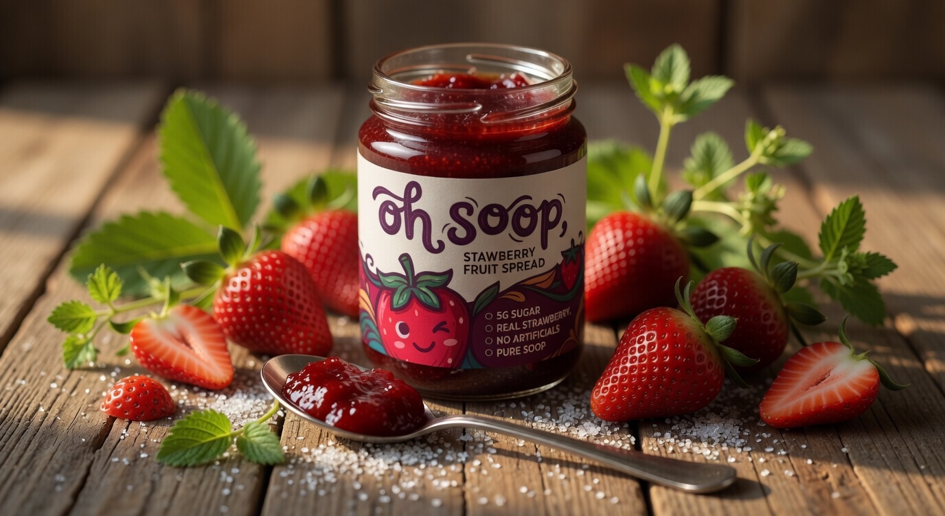
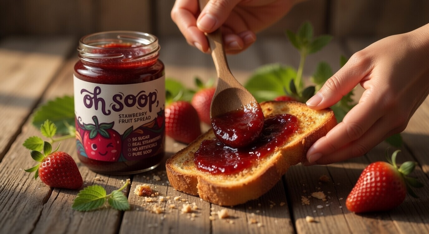
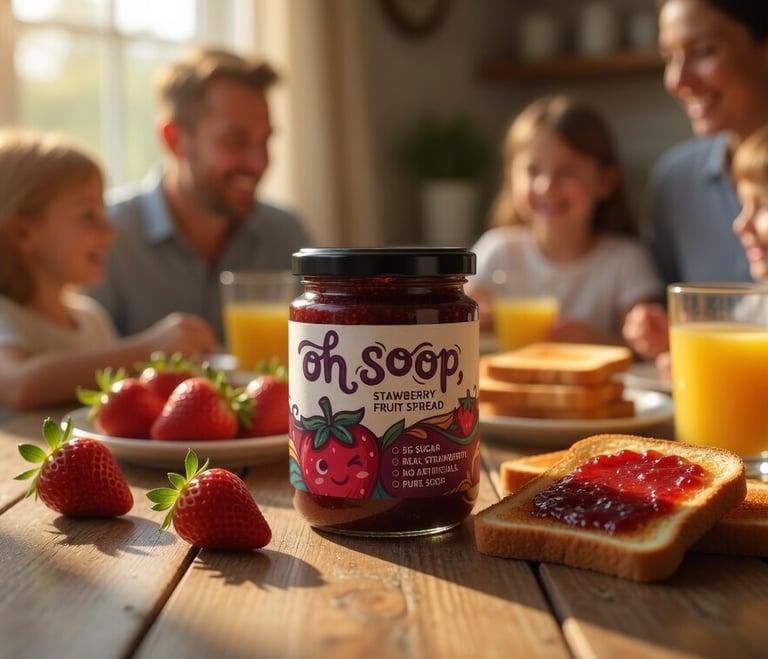
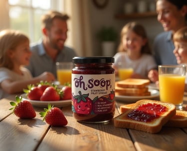
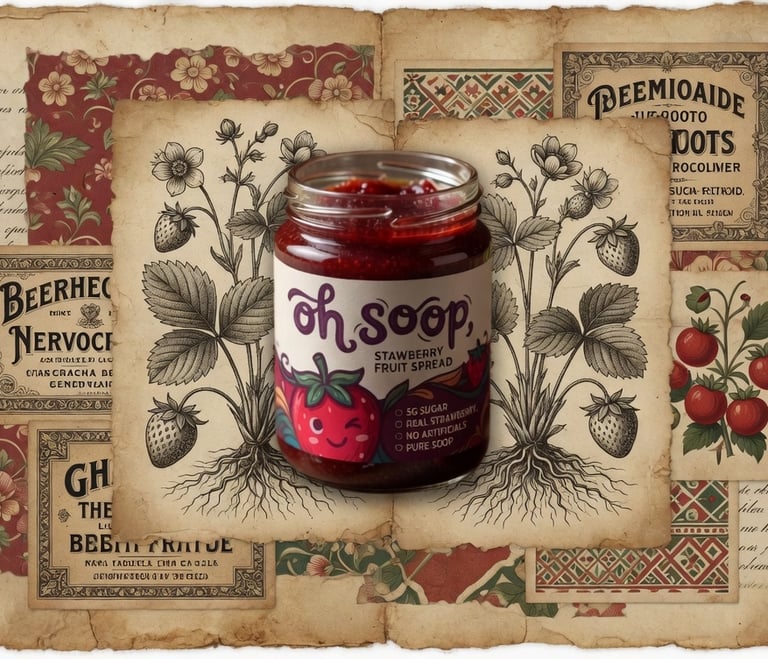
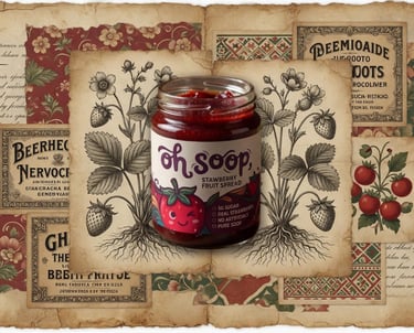
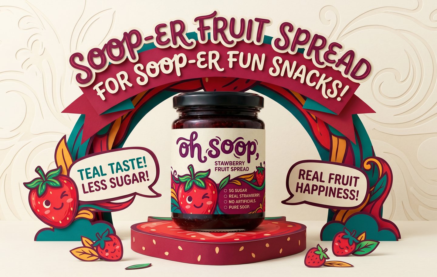
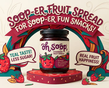
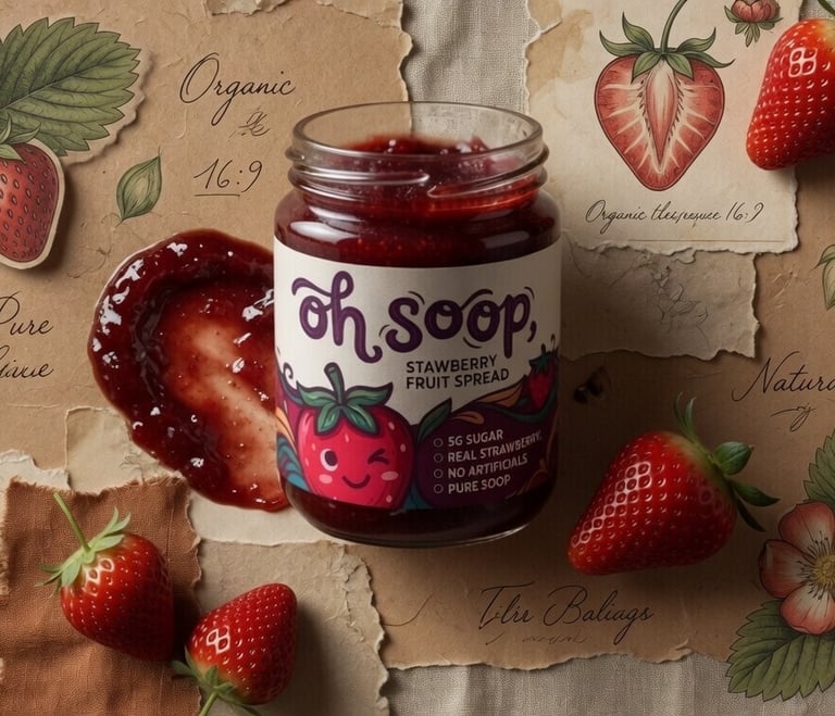
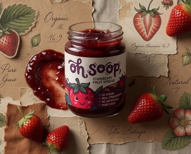
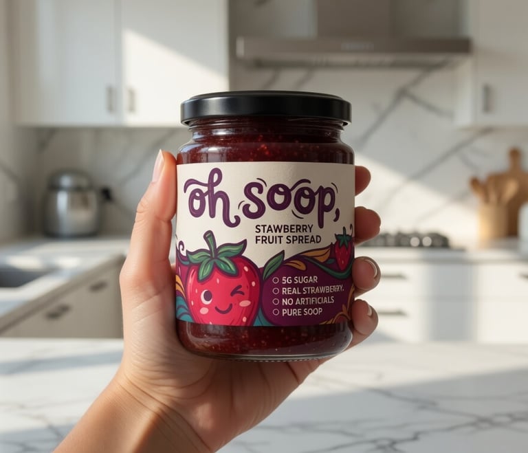
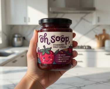
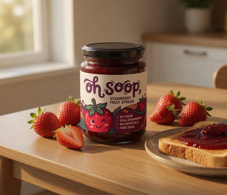
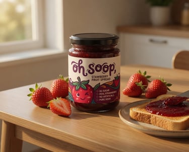
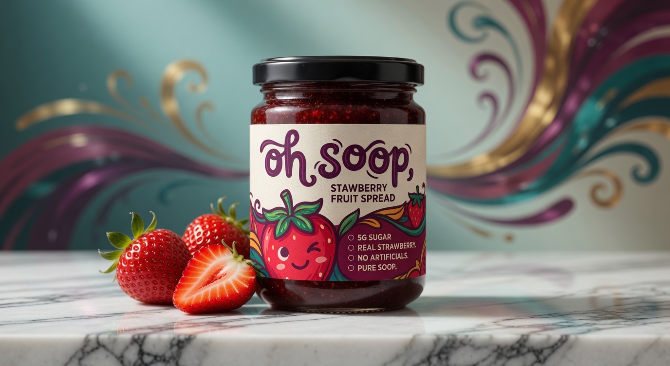
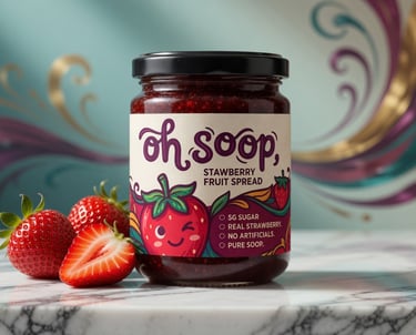
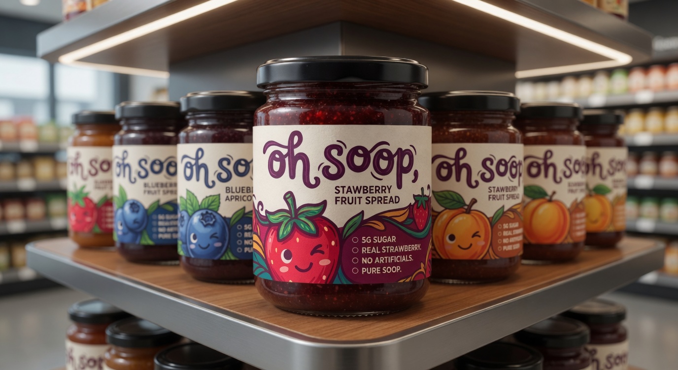
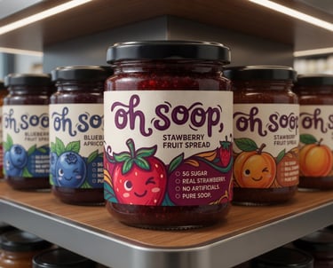
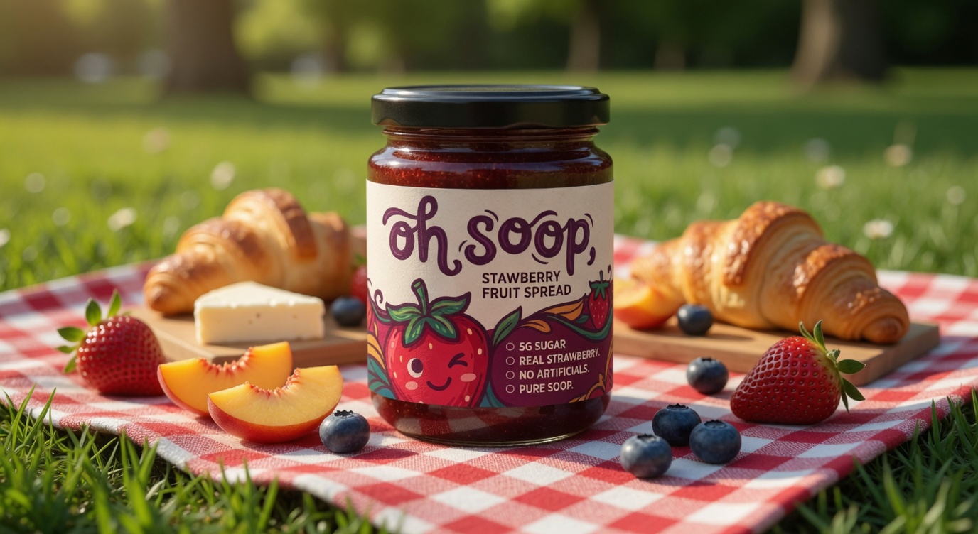
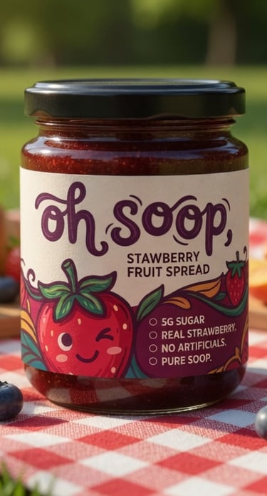
Oh Soop Strawberry Fruit Spread
Premium Packaging Design
Client: Oh Soop
Scope: Brand Strategy | Visual Identity | Packaging Design | Product Storytelling
Executive Summary
Oh Soop Strawberry Fruit Spread is a premium, low-sugar fruit spread crafted with real strawberries,
delivering authentic fruit-forward flavor without compromise. The brand stands for joyful indulgence,
natural goodness, and thoughtful simplicity offering a wholesome alternative to traditional jams loaded with sugar
and artificial additives.
The objective of this project was to develop a distinctive brand identity and packaging
system that captures the product’s playful personality, premium quality, and
clean credentials while creating strong shelf appeal and emotional connection with health-conscious
consumers who value real ingredients and delightful experiences.
Project Brief & Strategic Challenge
In a crowded category dominated by mass-market jams and artisanal preserves, even superior products can struggle to stand out if their packaging fails to communicate both premium quality and approachable joy. While Oh Soop’s formulation excels with 5g sugar, real strawberries, and zero artificial ingredients, the visual presentation needed to elevate it from a basic pantry staple to a desirable, feel-good everyday indulgence worthy of premium retail placement and repeat purchase.
The core challenge was to design a visual identity that balances fun, friendly appeal with sophisticated craftsmanship ensuring the product feels both playful and trustworthy on shelves alongside high-end food brands.
Core Strategic Insight
Today’s conscious consumers are not just buying spreads they are choosing moments of simple joy and better-for-you ingredients. They seek brands that deliver genuine taste, transparency, and a touch of delight without sacrificing quality or health. Oh Soop speaks directly to this mindset by turning everyday breakfasts, snacks, and recipes into something uplifting and nourishing.
Research & Strategic Foundation
The design process was guided by in-depth analysis including:
Trends in premium fruit preserves, clean-label foods, and playful gourmet packaging
Competitor benchmarking across supermarket, specialty, and health-focused brands
Consumer insights for families, young professionals, and health-aware buyers who prioritize real fruit and lower sugar
Requirements for strong visual impact in both physical retail and e-commerce environments
This research reinforced the need for a warm, approachable identity that highlights
natural ingredients while using illustration and color to create instant joy and memorability.

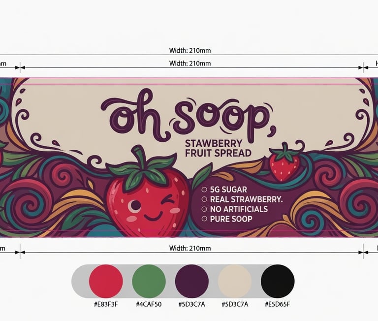
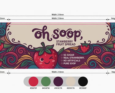
Brand Identity Development
We created a cohesive, vibrant visual language built on three core pillars:
Playful Authenticity · Natural Vibrancy · Premium Simplicity.
Key Identity Components:
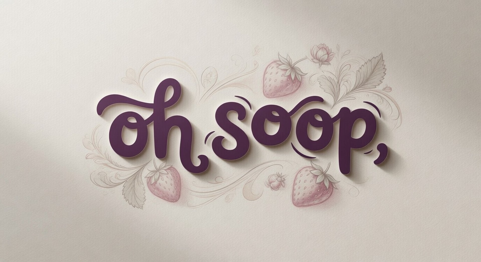
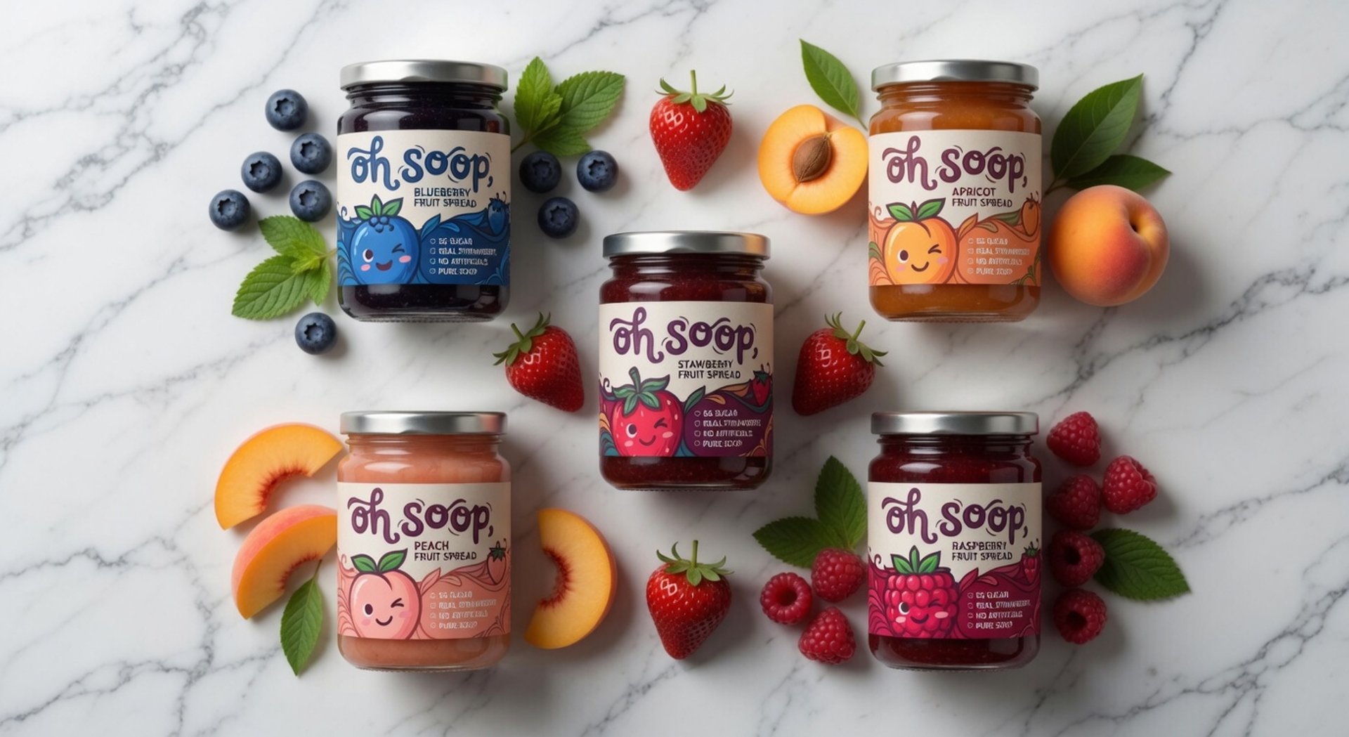
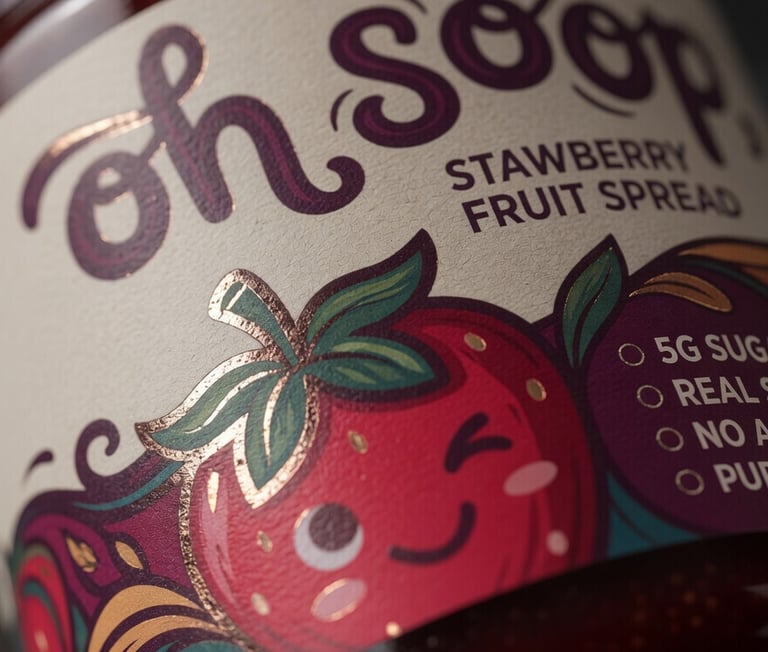
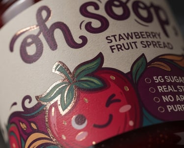
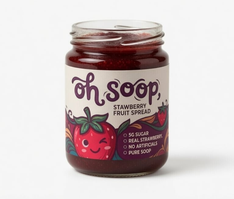
Signature playful yet refined typography with a custom wordmark for “oh soop”
Cheerful, character-driven strawberry illustration that feels friendly and premium
Rich color palette featuring deep berry reds, warm creams, vibrant greens, and accent purples
Clean, modern layout with excellent hierarchy that prominently features product benefits
Comprehensive brand guidelines for consistent application across packaging,
digital, and future product extensions.
The identity successfully marries whimsy with professionalism, the winking strawberry
mascot adds personality while the overall design feels elevated and trustworthy
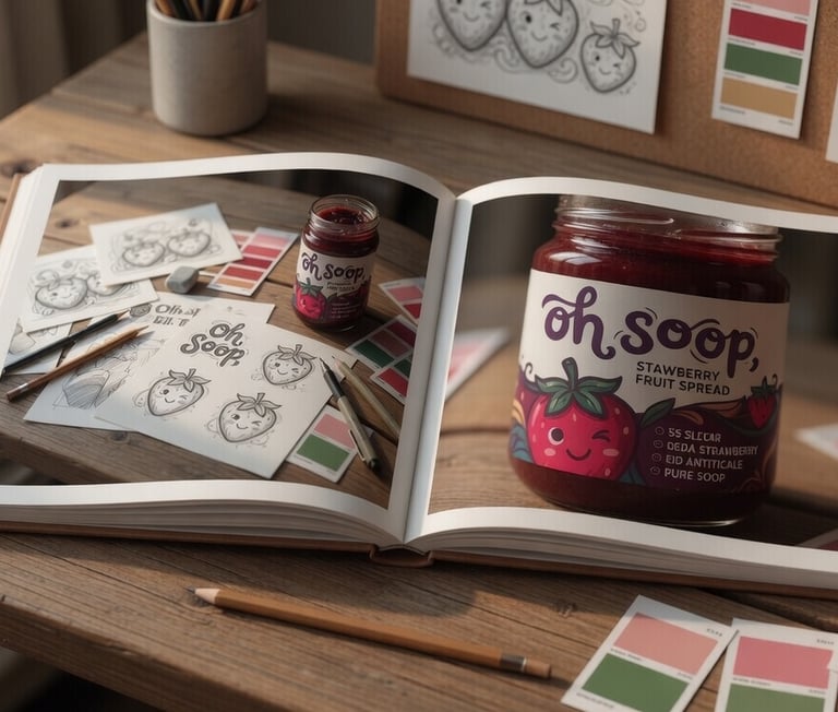
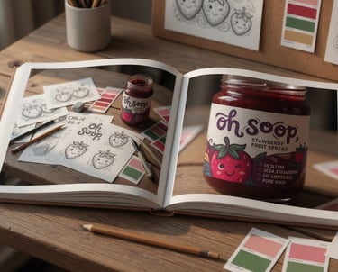
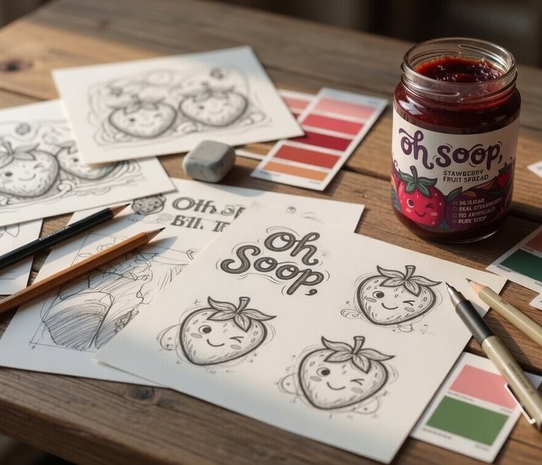
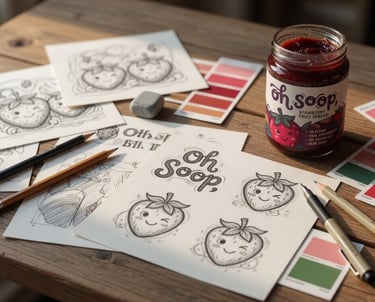
Creative Process & Design Exploration
Multiple creative directions were explored, ranging from minimalist typography-focused
approaches to more illustrative and character-driven concepts. Through iterative refinement,
we landed on the optimal balance that perfectly embodies Oh Soop’s joyful, honest,
and premium positioning. Moodboards, color studies, illustration development, and 3D mockups guided the final execution.
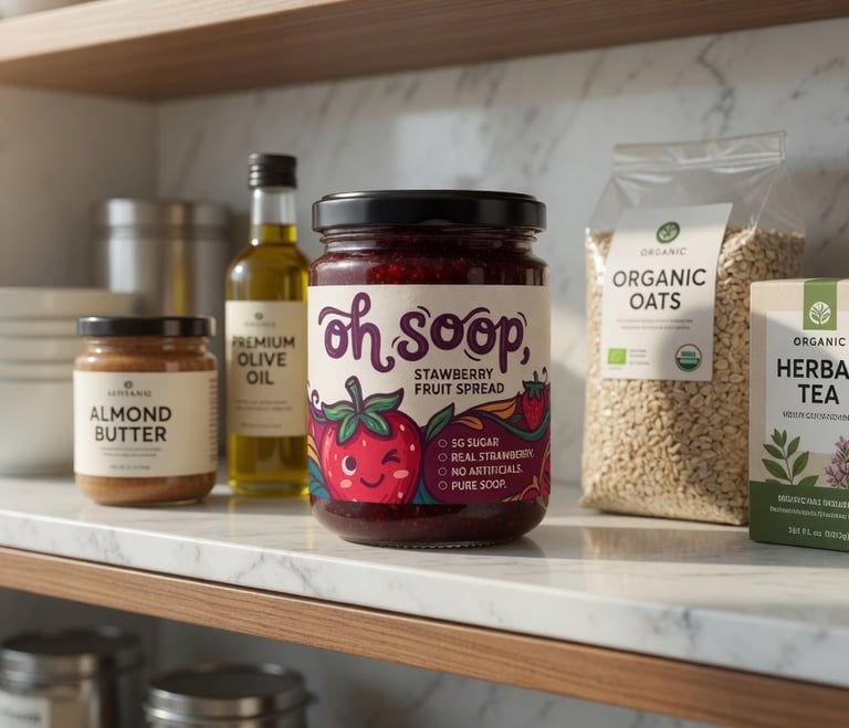
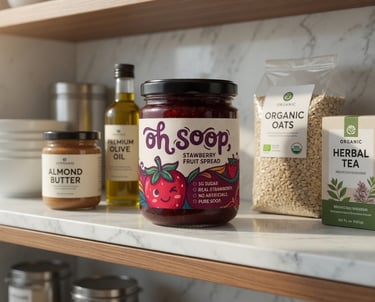
Project Impact & Results
The new brand identity and packaging have successfully positioned Oh Soop as a standout
premium-yet-playful fruit spread. Key outcomes include:
Elevated perceived value that justifies premium pricing
Strong differentiation through joyful illustration and clean credentials
Enhanced shelf impact and visual memorability
Cohesive visual system ready for marketing, social media, and line extensions (e.g., other fruit flavors)
A foundation that builds instant brand recognition and consumer affection
Ready to Elevate Your Food Brand?
Your product already has the quality. The right packaging and identity ensure it
communicates that excellence with clarity, personality, and shelf confidence.
If you have a great food product that deserves to be noticed and loved, we’d be happy to help craft
a distinctive brand presence tailored to your vision.
Let’s Create Something Shelf-Worthy
Reach out to start your design journey.
Email:
musab@designbymusab.com
© 2026 Design by Musab – All Rights Reserved
Address:
Siddiq Trade Centre, Lahore Pakistan